20 Front Door Paint Colors Ideas for Instant Curb Appeal
Your front door sets the tone for your entire home. The right paint color can change how your entry looks and feels without major work or cost.

You can boost curb appeal and express your style simply by choosing the right front door color. From timeless neutrals to bold shades that stand out, you will explore options that fit classic homes, modern spaces, and everything in between.
1) Classic Black for timeless elegance

You can never go wrong with a black front door. It gives your home a clean, strong look.
Design experts often call black a simple and timeless choice, as noted in these best black front door paint colors.
Black pairs well with brick, stone, and light siding. It also works on modern and traditional homes.
2) Bold Red to make a strong statement

Choose bold red when you want your entry to stand out. It draws attention and adds clear contrast.
Explore shades in this guide to red front door paint colors. Pair red with neutral siding to keep the look balanced.
3) Navy Blue for a sophisticated look

Choose navy blue when you want a clean, refined entry. It pairs well with white trim and brick exteriors, as shown in these navy front door color pairings.
You can also explore expert picks like Benjamin Moore’s Blue Note for a deep, balanced tone. Add simple hardware in brass or black for contrast.
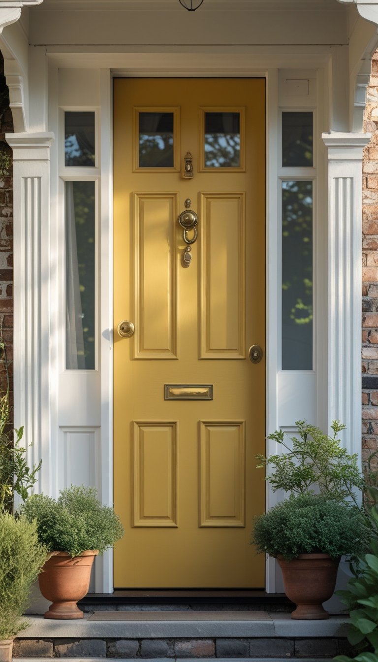
4) Sunny Yellow to brighten the entrance

Choose sunny yellow if you want a warm, welcoming look. Yellow often signals happiness and works well on many home styles.
You can explore ideas from these yellow front door paint colors. Pick a shade that suits your siding and natural light.
Yellow also stands out among other colorful front door ideas. Use it to create a clear focal point at your entry.
5) Forest Green for natural charm

Choose forest green if you want a calm, grounded look. This deep shade connects your entry to nature without feeling bold or loud.
You can see ideas in these dark green front door designs. Pair it with brass hardware or white trim for clean contrast.
6) Bright Turquoise to add a pop of color

Choose bright turquoise when you want a clear pop of color at your entry. It adds energy without feeling harsh.
A turquoise front door works well on coastal, cottage, or modern homes, as shown in these turquoise front door ideas. Pair it with white trim or natural wood for balance.
7) Crisp White for a clean, modern feel

Choose crisp white when you want a simple, modern entry. It creates a clean look that feels fresh and direct.
You can explore ideas from these white front door ideas to see how hardware and glass details change the style.
Pair white with black trim for contrast, or keep trim white for a seamless design.
8) Warm Orange for inviting energy
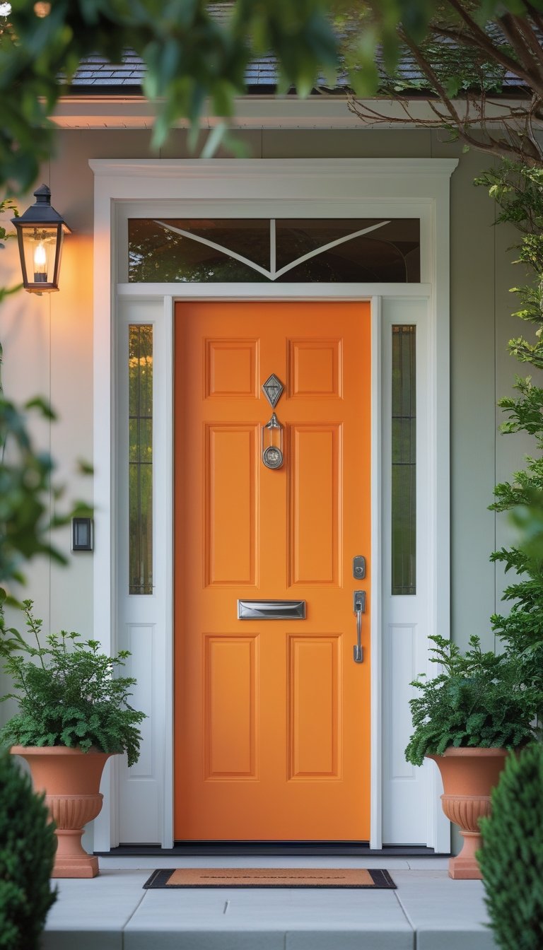
Choose warm orange if you want a front door that feels welcoming and lively.
Shades like burnt orange or terracotta add depth without looking too bright. Browse ideas from HGTV’s front door color gallery to see how orange boosts curb appeal.
Pair it with gray, cream, or white trim to keep the look balanced and clean.
9) Deep Burgundy to convey richness

Choose deep burgundy if you want a front door that feels refined and grounded. This rich red tone adds depth without looking bright.
You can explore ideas from these burgundy front door designs for curb appeal. Pair it with brass or black hardware for a clean, balanced look.
10) Soft Gray for subtle contrast

Choose soft gray when you want contrast without strong color. It pairs well with light siding and brick.
You create depth while keeping a calm look. Explore ideas from these grey front door designs to match your trim and hardware.
Soft gray suits modern and traditional homes.
11) Vibrant Coral to stand out boldly

Choose coral when you want a bold yet friendly entry. Coral blends red, pink, and orange, which gives your door warmth and energy, as explained in this guide to a coral front door color.
Pair coral with white, light gray, or beige siding. The contrast helps your door stand out without clashing.
12) Rich Teal for a trendy twist

Choose rich teal when you want color without going too bold. It adds depth and works with brick, white siding, or gray exteriors.
Many designers feature teal in teal front door ideas for curb appeal. You can also explore examples in these teal front door photos and ideas.
Use satin or semi-gloss paint for a clean, durable finish.
13) Matte Charcoal for urban appeal

Choose matte charcoal when you want a clean, modern look. This deep gray works well on brick, siding, or painted exteriors.
Sherwin Williams Cyberspace offers a bold black with a hint of blue, which suits city homes with simple lines. See this example of Sherwin Williams Cyberspace.
Pair it with light trim for contrast. Keep hardware black or brushed steel for a consistent finish.
14) Gentle Lavender to soften the exterior

Choose gentle lavender if you want a calm, welcoming entry. This soft shade adds color without feeling loud.
A lavender front door brings subtle charm and personality, as shown in these lavender front door ideas. Pair it with white or light gray trim for a clean look.
15) Classic Navy paired with white trim

Choose classic navy for a strong, clean look. Pair it with crisp white trim to create sharp contrast and clear lines.
This timeless navy and white exterior pairing works well on colonial and Cape Cod homes. You can review ideas in these navy blue house exterior examples.
16) Glossy Cherry Red for a polished finish

Choose glossy cherry red when you want a clean, polished look. The shine reflects light and makes your door stand out.
Explore popular shades in this guide to cherry red paint colors. Pair it with crisp white trim for sharp contrast.
17) Muted Olive for understated elegance

Choose muted olive when you want depth without bold contrast. It feels calm and refined.
Designers often favor darker olive shades for exterior doors because they read as soft neutrals, as shown in these olive green paint colors designers love.
Pair it with warm brick, cream siding, or black hardware for a balanced look.
18) Bright Aqua for coastal vibes

Choose bright aqua when you want a clear coastal look. This color feels fresh and clean without looking too bold.
You can pair it with crisp white trim for contrast. For more ideas, explore these coastal front door color ideas to guide your choice.
Bright aqua also works well with light gray siding or sandy beige walls.
19) Warm Taupe to complement natural surroundings

Choose warm taupe if you want a calm, balanced look. This shade blends brown and gray tones, which helps it pair well with stone, brick, and wood.
Design guides on exterior taupe house color combinations show how taupe works with natural textures. You create a smooth transition between your home and the landscape.
20) Bold Mustard for a vintage touch
Choose bold mustard when you want a warm, vintage look. This deep yellow feels grounded and classic.
Designers highlight mustard as a rich option with earthy undertones in these mustard paint colors and room ideas. Pair it with brick, dark trim, or aged hardware for balance.